COLOURS
Before the beginning of the New York Fashion Week, the Pantone Institute for Color announced its forecast, including 12 shades among the trendy colours of the spring-summer 2019 season. Four more neutral colours came into the palette this season.
So, what colours of clothes and accessories, according to Pantone, are the most fashionable and popular in the coming season?
The main palette of fashionable colours for spring-summer 2019 includes:
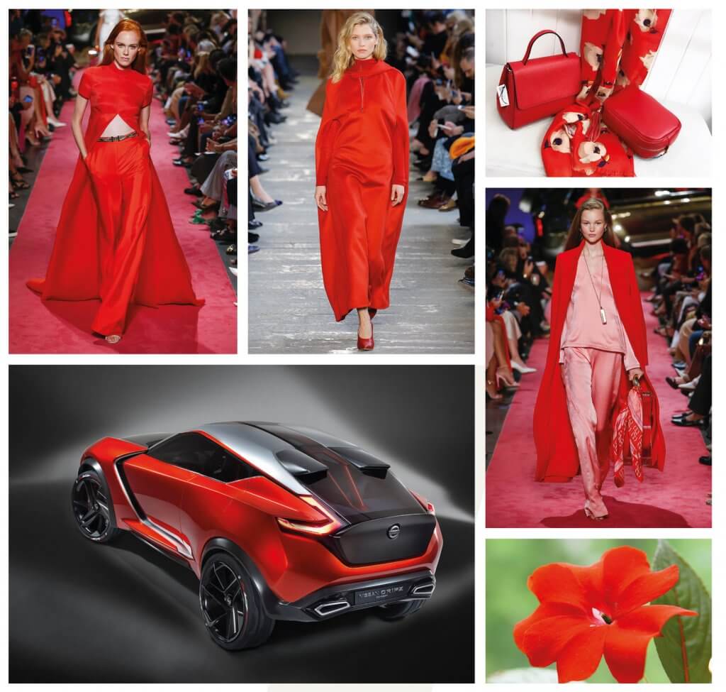
Fiesta:
A bright red-orange hue, “Fiesta” is the essence of extra brightness, passion and fire. Dynamic, very active and energetic, this colour will highlight its wearer from any crowd.
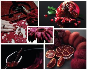
Jester Red:
The deep and intense burgundy may not be very associated with spring and summer, but it looks very elegant, elegant and expensive – like a sip of aged red wine.
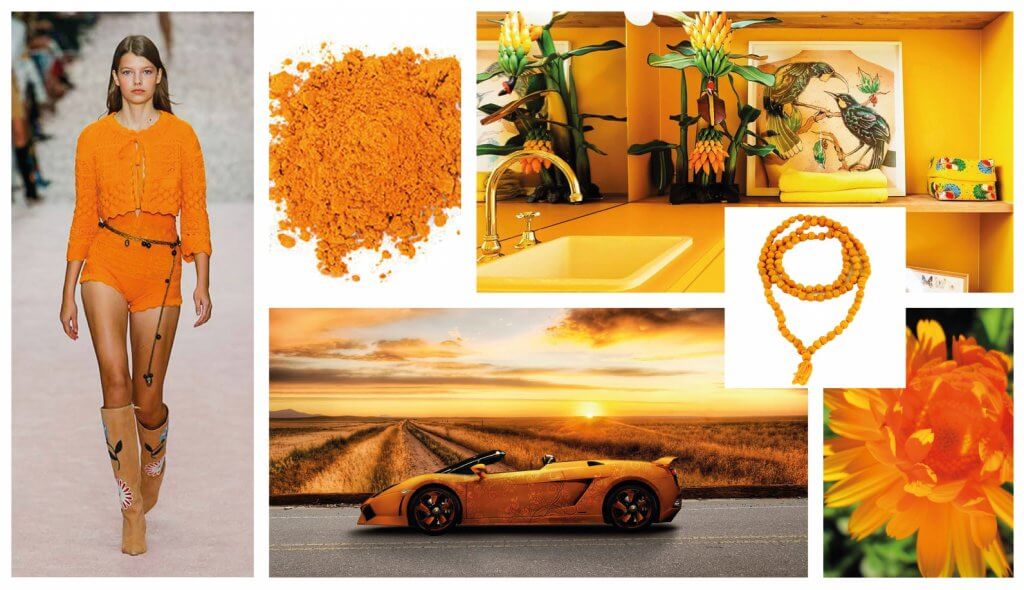
Turmeric:
“Orange, but not orange”, this bright, joyous colour will be the answer to the riddle. Turmeric is, rather, a curtsy towards turmeric itself and a recommendation to bring some “spice” into your trendy wardrobe.
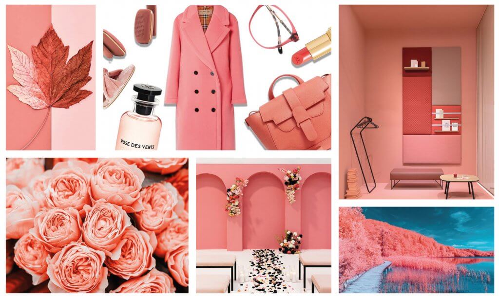
Living Coral:
Tenderness, femininity, comfort – the soft and subtle shade of coral, with a subtle golden glow, brings such notes to the palette.
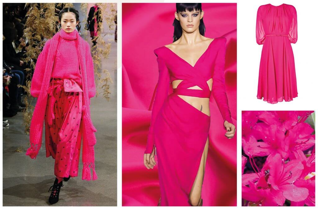
Pink Peacock:
The spectacular, bold shade of intense pink is already familiar to us from the palette of fashionable colours of autumn-winter 2018-2019. Experts and consumers agree that the “Pink Peacock” is a real feast for the eyes. Well, the carnival continues, and there is still a whole season of experiments ahead!
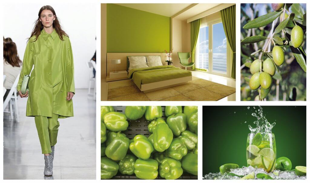
Pepper Stem:
Calm and natural yellow-green offers the most to the spring-summer wardrobe. The “stalk of pepper” brings associations with the awakening and flowering of nature and soothes the overall brightness of the fashionable palette.
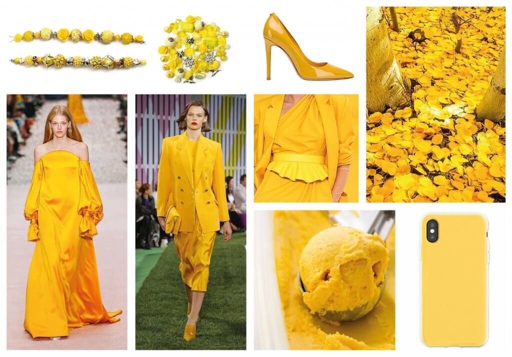
Aspen Gold:
“Golden Aspen” is a shade with autumn notes in its name, but it is very summery in its essence. And, so that one does not contradict the other, you can compare it not with a tree devoid of leaves, but with a gentle sun, which leads everyone into a good mood and towards joy.
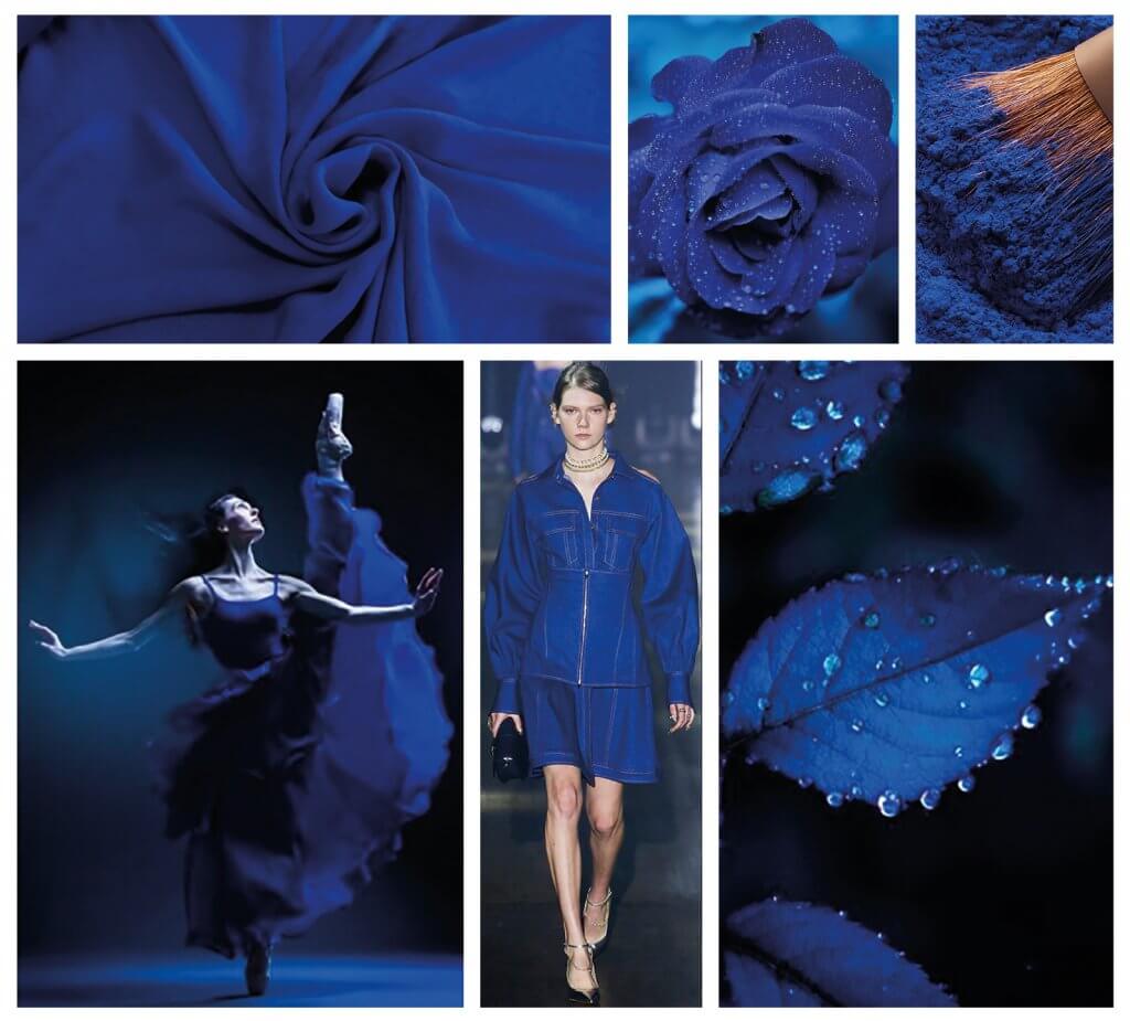
Princess Blue :
The only representative of the cold shades this season, Princess Blue looks really luxurious, regal and majestic and dilutes the bright warmth of its neighbours in the palette with its freshness, depth and coolness.
Toffee:
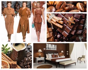
Sweet toffee is the first association one makes with this delicious shade of brown. Warm, appetizing and thorough, Toffee will add stability and consistency to your image and will be an excellent background for the rage of trendy colours in accessories.
Mango Mojito:
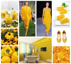
Calm, richness, comfort – it’s all about the golden yellow “Mango Mojito”. The colour is pleasant not only to look at, but also soothing to the soul, giving us comfort and magically bright sensations.
Terrarium Moss:
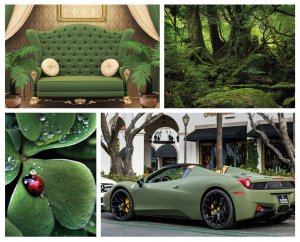
With thoughts of the majestic beauty of nature and the pacifying rustling of leaves in a dense forest, the deep and dark shade of Terrarium Moss makes it possible to achieve an uncommon feeling of complete union with the outside world.
.
Sweet Lilac:
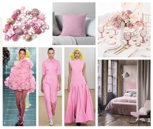
The charm of freshness, tenderness and innocence gives us the most floral shade of the current palette – a light and delicate pink that is the perfect union of lavender and lilac.


